

Love Always Case Study
Introduction
Long distance relationships are tough, there is no way around that fact. The absence of physical contact with a significant other means there’s an absence of the many ways couples indirectly communicate. There’s no small smile tell you that your partners in a good mood, no soft squeeze on the shoulder to tell them everything is going to be okay, and no kiss goodbye that expresses “I’ll be thinking of you until we meet again”. Sure, technology has helped immensely with direct means of communications, but it still offers little in the ways we maintain connections with our romantic partners.
Problem Statement
The current technology commonly used to communicate between long distance couples fails to emulate the uniquely intimate, subtle, and dynamic connections found in relationships where partners are not physically separated from one another.
Solution
A communication app that is synced with a smart light which couples can use to either set a mood for one another or augment a message.
Target Demographic
People who are in long distance relationships. Typically younger people who are between the ages of 18 - 30 years old.
Target Demographic
- % of emotions and tonality couples are able to communicate effectively
- # of successful predicted interpretation changes triggered by light tone feature
- # of users who can successfully utilize key features
- # of users who focus on the light before reading last received message
Expected Result
- Users will focus first on the light, indicating that they are having a more immersive experience
- Much greater success using lights to emphasis a tone rather than light-only communication
- Color of light displayed with the message will change how the user internalizes the information
The Solution
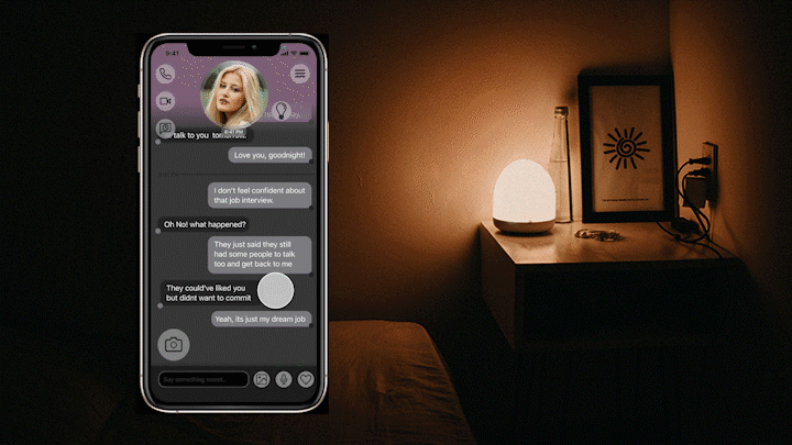
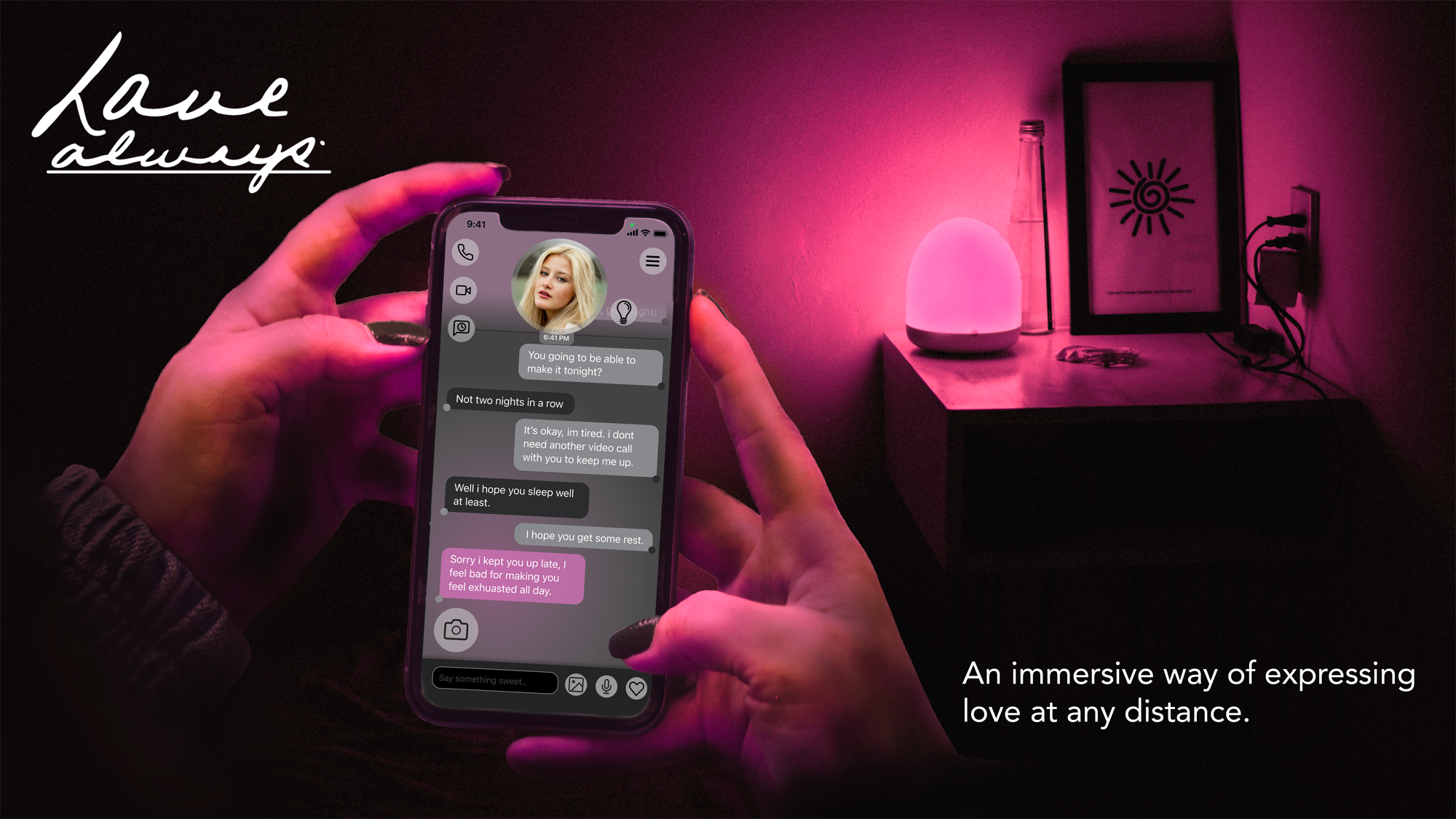
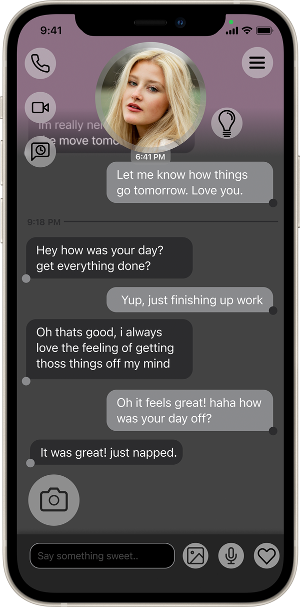
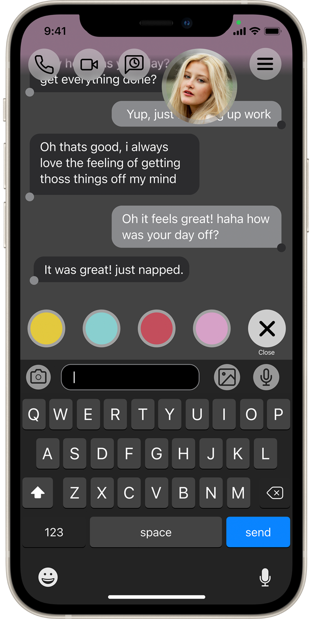
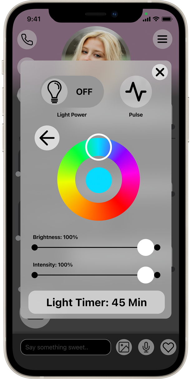
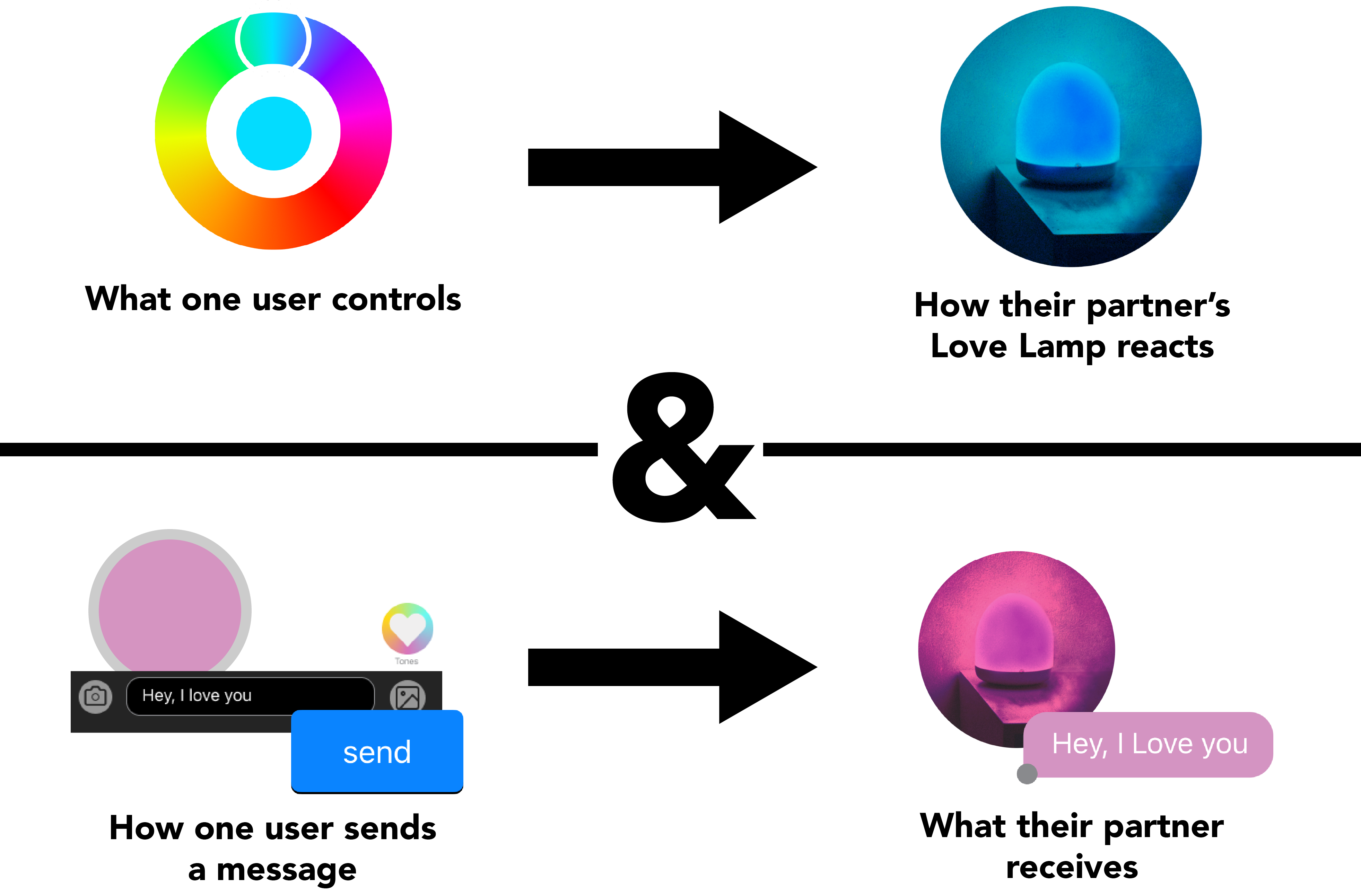
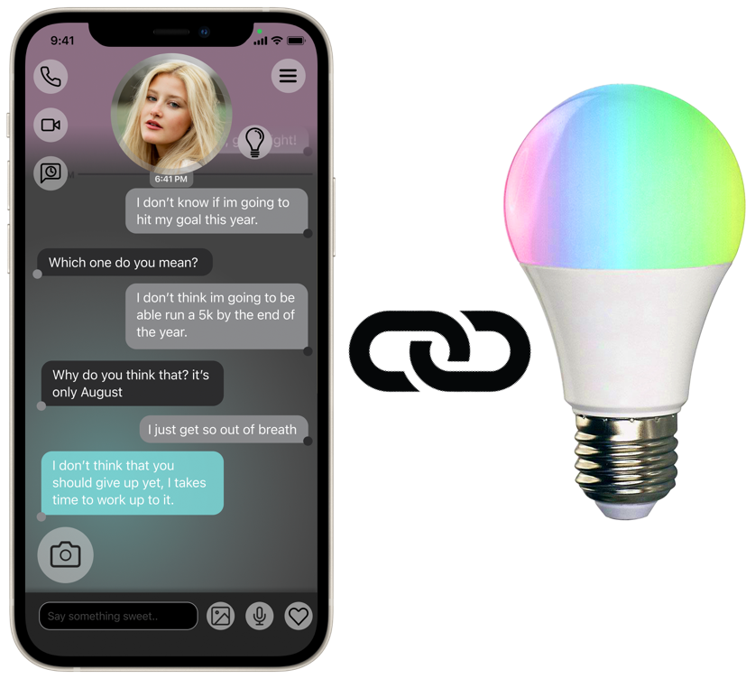
Enter LoveAlways, a communication app that pairs with a unique lighting feature, or Love Lamp, allowing couples to control one another’s lighting directly or through texts. The light can be controlled independently to set a mood for a partner, or a message can be sent which causes the light to pulse a selected color, emphasizing an intended tonality. The Love Lamp turns messaging into an immersive experience, taking an element of the conversation off the screen and into the environment. Through immersion, couples can create a much more intimate space where they can express different emotions through different colored lights. Similar to other communication apps, LoveAlways also offers the ability to talk and video chat when messaging isn’t enough.
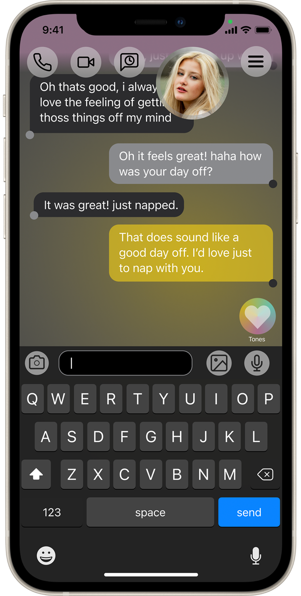
Why Not Emojis?
Unlike the use of GIFs and Emojis, colored light is a more subtle way of emphasizing a message, leaving more up to interpretation yet still communicating inflection or tone.
Additional Specialized Features
- Designed to only be used between two people
- Light Timer to ensure that there is a more emotional significance when activated
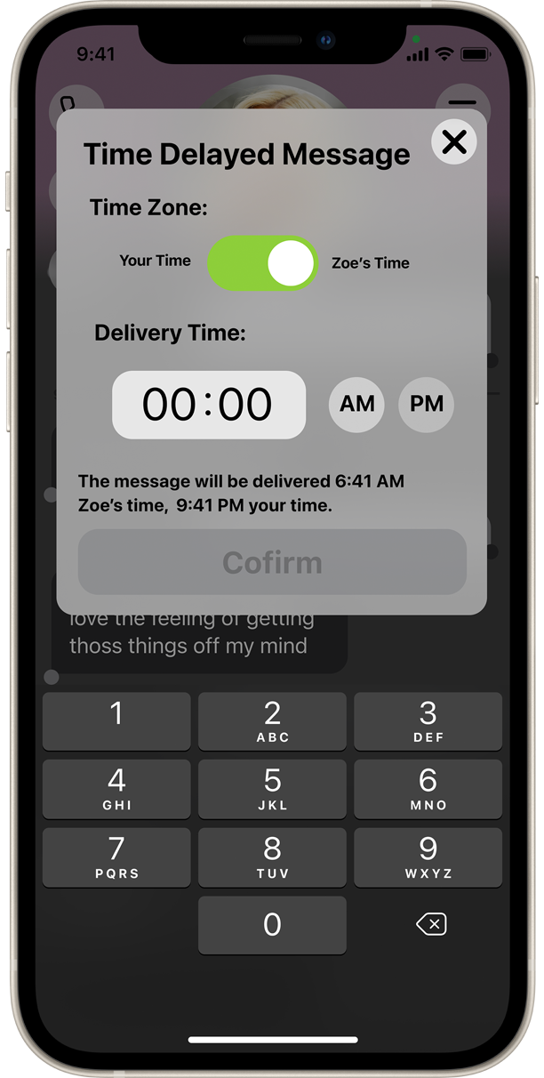
- Time Delivered Messages to compensate for time difference
Project Timeline
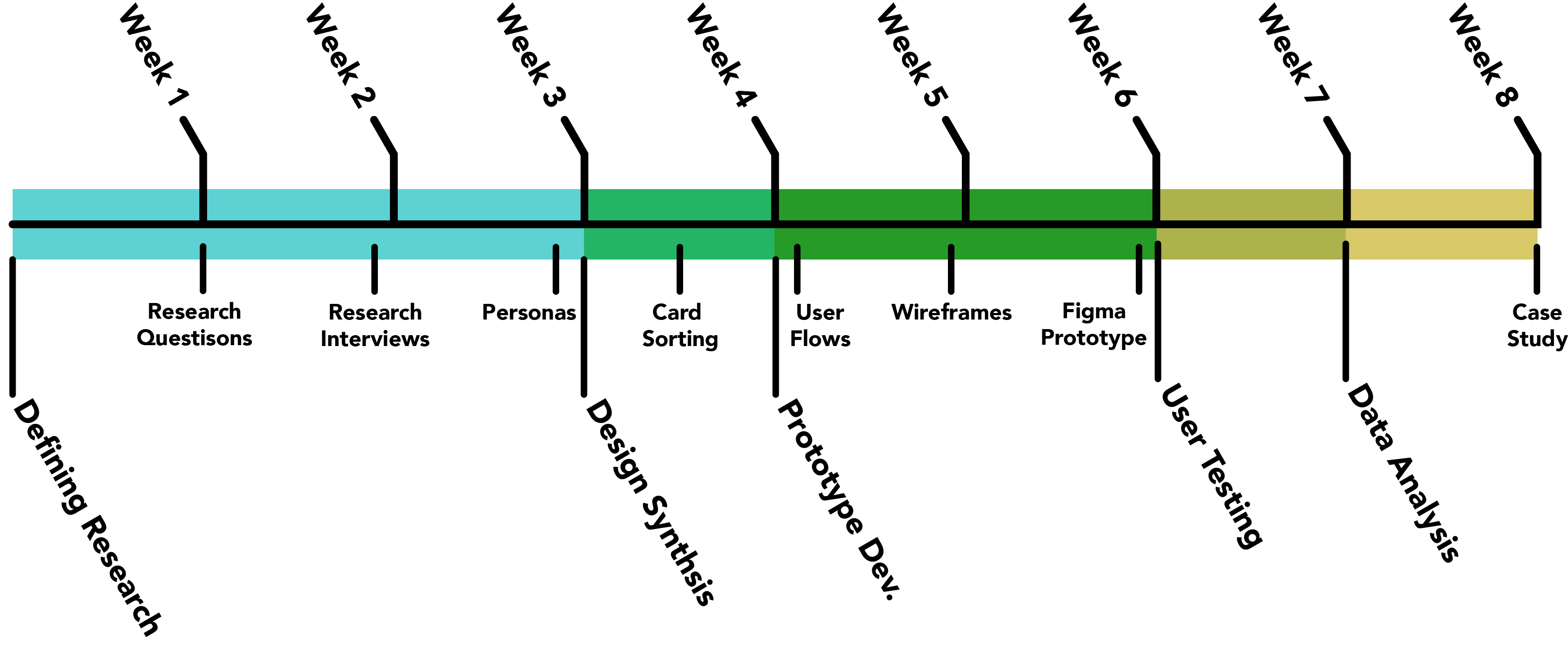
- The project was completed as a capstone for my MPS Degree in UX Design from MICA.
- 8 week Timeline
- One person team
- Limited budget
Research
- Research questions I set out to answer:
- What currently enables people in a long distance relationship to feel the most connected with their partner?
- What platforms were couples using to communicate?
- What actions do they take when they contact their partner or vice versa?
- How does the process of communicating with their partner differ from communicating with other people?
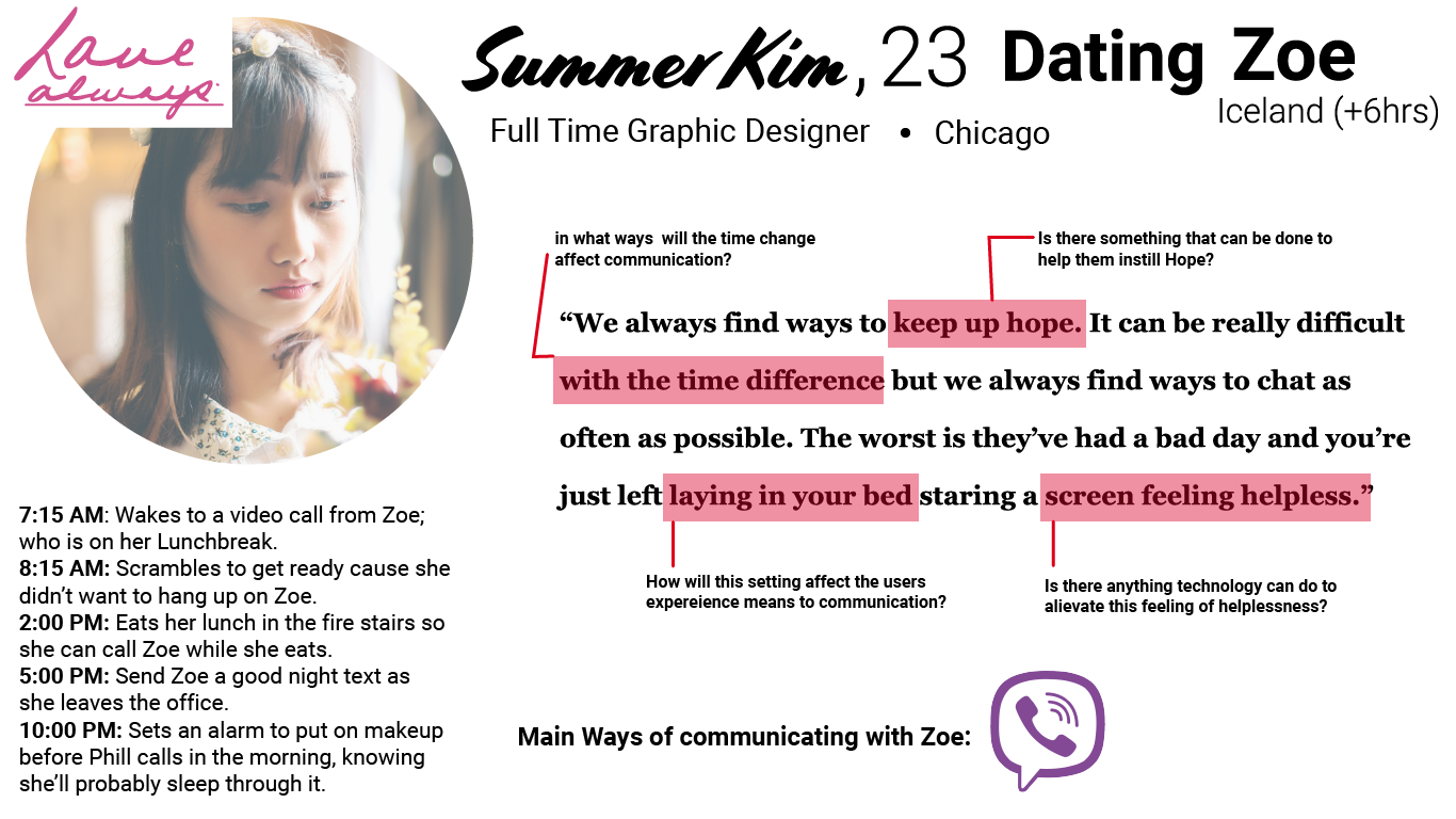
- Primary form of research: Interviews
- 4 Potential users were interviewed.
- All between the ages of 18 - 30.
- Been in a long distance relationship for at - least 6 months.
- Varying range of time difference between partners (1-6 hrs).
- Secondary forms of research:
- Survey Data
- What questions are being asked on forums
- Blogs/vlogs
- Competitive analysis
Design Synthesis
Key Insights
- When possible users rely on more involved forms of communication when there’s a short window to conveniently communicate.
- Users will often wake up early or stay up late to talk to their significant other due to time differences.
- As communication become more involved, users will move to a place where they have safety and privacy.
- Users are looking for a safe and secure way of communicating.
- Users frequently reported using long distance sex toys and expressed how unique the experience of affecting their partner's environment from a distance was.
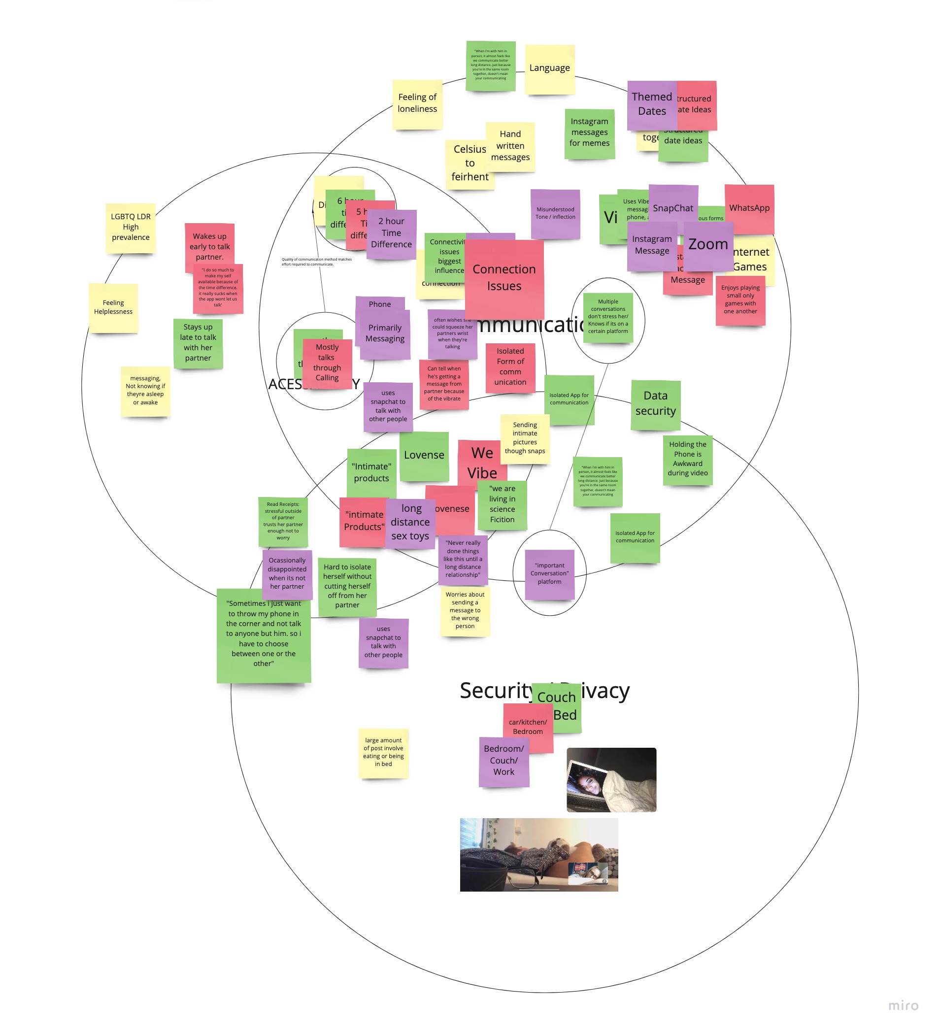
Card sorting was the primary way of generating ideas. While I did the first round of card sorting myself, I would often ask others to do the same. By having other people sort the cards in categories, then have them explain their thinking behind their decision, I would often glean new insight into how the long distance relationship system functioned.
Prototyping
Incorporating Hardware
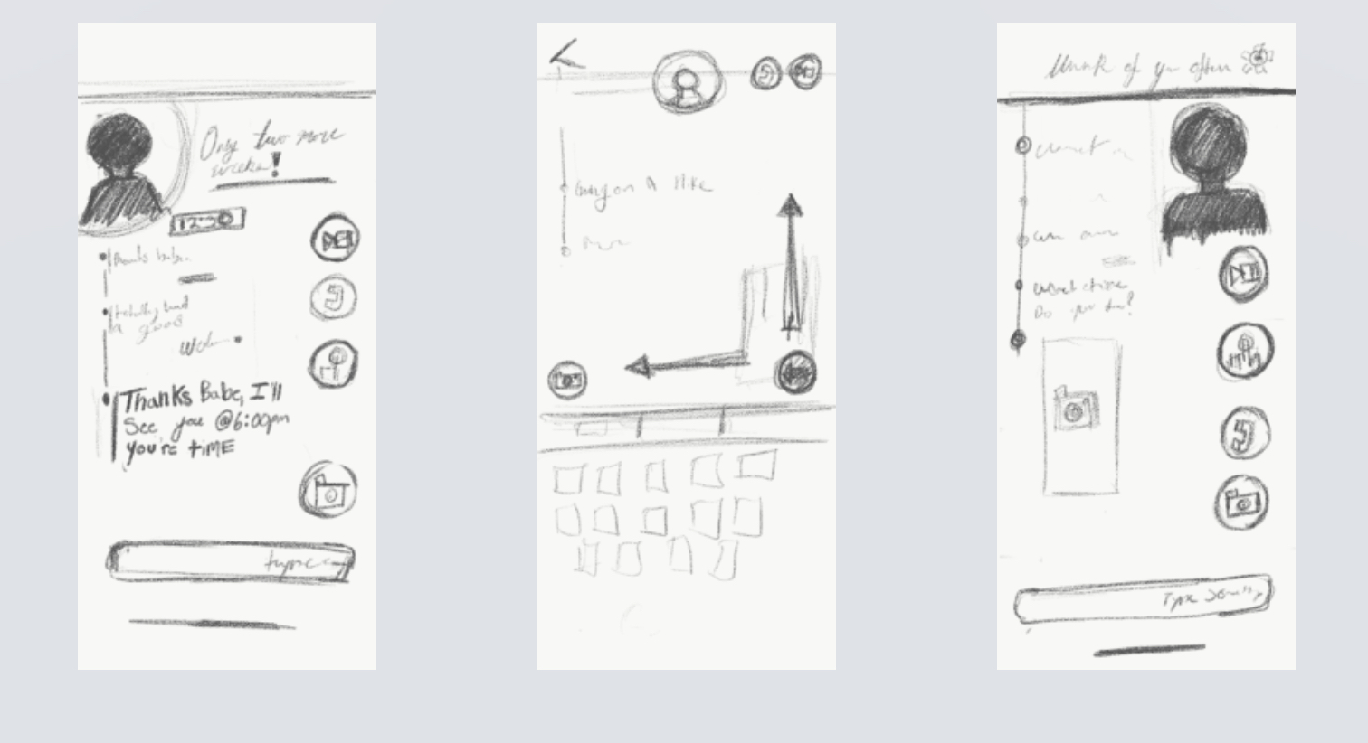
Starting with the light, the only workable answer was to do something with smart lights. They are accessible enough where couples could get them in time for testing and they can be controlled from anywhere. The second part was the application itself, which would be built using Figma. The question then became “how do we link them?” After exploring options that could link the UI prototype with the smart light, it became apparent that I would simply have to ask participants to download the smart light application and have them control it directly from there. When necsessary, I would also act as the man behind the curtain and trigger the lighting events myself while users shared their screens.
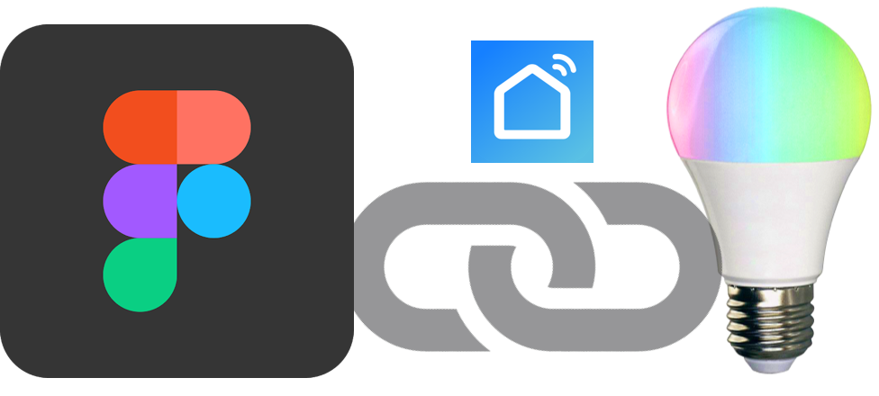
- Figma was used to create the UI prototype
- Smart Life was used to control the smart light bulbs
- Smart light bulbs were ordered through Amazon and shipped to participants
Testing
The testing was preformed with four couples giving eight data points to draw conclusions from. All testing was done over a the course of one week. Smart light bulbs were shipped to participants’ houses, and Zoom was used as a form of communication. Due to the time constraints surrounding shipping, three out of four couples were not long distance. However, this was not crucial to testing. The most important aspect was the couples’ understanding of one another.
- Testing procedure for light-only communication:
- Separated from one another in their homes so that they could not see or hear one another.
- Installed one of the two synced smart light bulbs into a visible lamp.
- One participant was instructed to pick a color that they would send to their partner if they were trying to convey a given emotion or tone.
- After the selection was made, their partner would be addressed individually and asked how they would interpret the color sent by their significant other.
- Testing Procedure for Message Tonality emphasized with Light:
- Users were shown multiple pairs of conversations. Each pair was comprised of two of the same conversation, only each had been reworded and the final simulated message was displayed in a different color.
- When the message would appear on the screen, the smart light bulbs pulsed the corresponding color of light.
- Once the user was done reading each conversation, they then were asked how they would have responded to the final message.
- The response was then compared to the matching conversation in that set, giving an indication of how the pulsing color changed the user’s interpretation.
Results
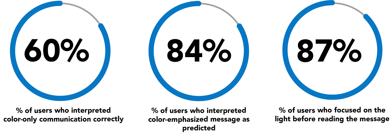
Prototype testing found that couples had approximately 60% accuracy in broadly interpreting their significant other’s intent through just the color of the light. Users also seemed to become more confident and accurate as the testing went on, often misinterpreting the first color sent by their partner. On average there was an 84% chance of users changing their interpretation of the message, or noted a predicted disconnect when the light was pulsed in tandem with a message.
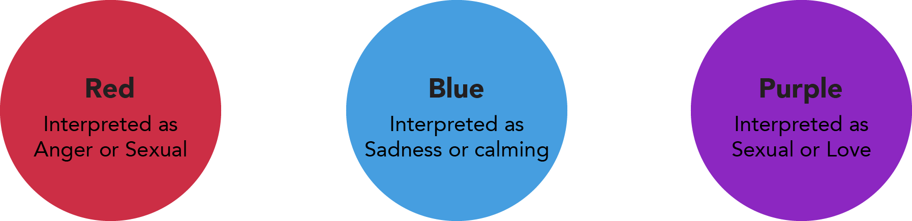
Colors interpreted <80% Consistently (light-only testing)
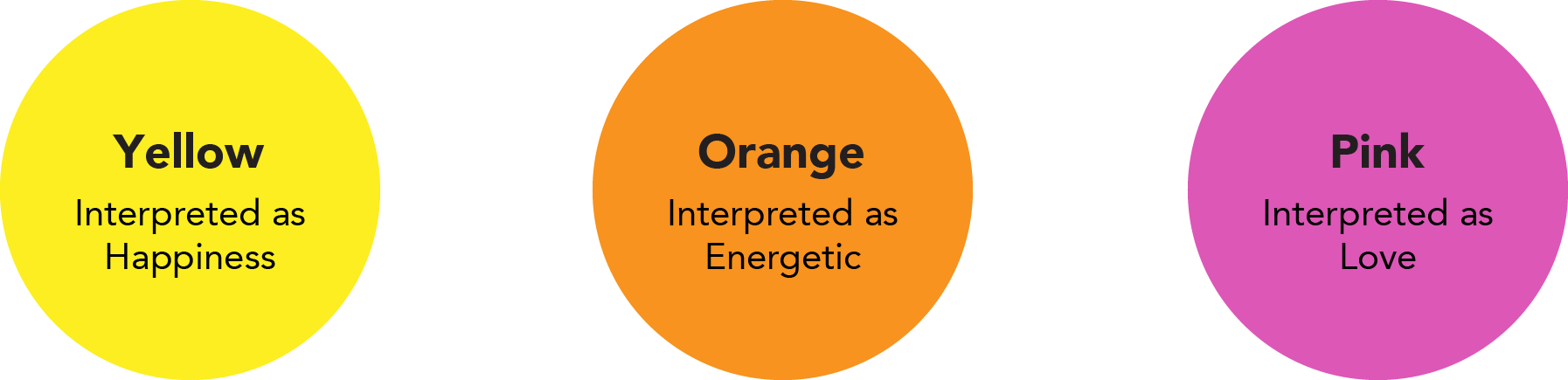
Colors interpreted >80% Consistently (light-only testing):
Conclusion
The results of the tests suggest that my proposed solution would help ease couples problems when communicating in a long distance relationship. I anticipated that there would be a lower level of accuracy with light-only communication as it is an indirect form of communication. It is encouraging to see that the light changed users interpretations and how many users were focused on the light during testing. This points to the experience being an immersive way to help couples communicate. From here, I would suggest creating a more developed prototype to test how couples interact with each other, as they would in normal conversations, as opposed to a simulated one.
During this project I learned a lot of things about the UX process, but my biggest take away is what to do when you're forced to pivot. My original solution involved incorporating more sense into the immersion such as smell, however that proved too hard to prototype. Taking this in stride because of the deadline, I had to learn to re-synthesize by isolating what it was about my blue sky idea that was addressing the problem; immersion. From there it was up to my creative problem solving to come up with a viable prototype for the new solution and the rest would fall back into my UX process.